Some Fun Site

Baby Names : Animated Bubble Charts

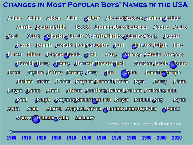
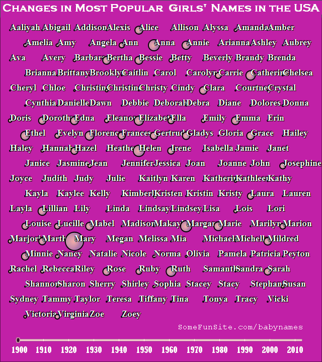
These animated bubble charts contain the superset of the top 25 names for each year - one chart for male names and one for female names.

The chart for female names is larger because the list of top 25 names changes more from year to year. Male names seem to be more consistent.

The area of the circle for each name is proportional to the number of babies given that name that year. Large circle = popular name.

animation showing the growth of popular male baby names over the years
animation showing the growth of popular female baby names over the years

Comments or Questions or Other Categories of Communication

Name:

Email: Email address is required but will not be made public. It is used as your unique ID, not as an email address, so you do not have to give your real email.

Comment: